Public space has been defined by researchers based on use, accessibility and ownership. It is further guided by ethnical, demographical and design-based elements, explaining use as well as the users of space. Public spaces as shared community spaces are responsible for facilitating and structuring sociocultural activities and community interactions. As a platform for engagement, these spaces have been considered the medium for cohesion of sociocultural activities in the built form. Quality of public spaces is also related with the quality of urban life in cities. The liveability of the cities and the quality of its social life are associated with its public spaces. Defined as ‘place of simultaneity’ by Madanipour, public space can be seen as a stage for performance and at the same time as a test for reality.
A network of open spaces in the city and its relation with urban resilience is increasingly being recognised. The flexibility in the nature of public spaces explains its appropriation to various uses by users under various circumstances. Along with social and recreational activities, the use of open public spaces at times of disaster is highly recognised. The public space and its collective dimension becomes central in situations like hazards and disasters as the feeling of fear is mutual and shared by all. These public spaces play a prominent role in integration and motivation of the community to progress together towards recovery.
Community engagement towards common goals and intentions like reconstruction are also demonstrated in their collective actions, for which the public space provides a platform. Open public spaces, post-earthquake, are transformed with several functions, like shelter spaces, temporary houses, storage and distribution of supplies. With the additional layer of these functions, they play the role of a ‘second city’.
Thus, well-designed public spaces not only contribute towards the welfare of citizens and quality of everyday life, they also have the capacity to facilitate recovery in environments that are vulnerable to natural disasters. Recovery here could mean immediate as well as long term revival of the community.
This article aims to understand the transformation of public spaces in a post-natural disaster scenario, through the case study of Bungamati in Kathmandu, Nepal. The research and documentation for the article are based on an urban development exercise as a part of post-earthquake rebuilding efforts with KU Leuven in 2015, where the author was an active member of the team.

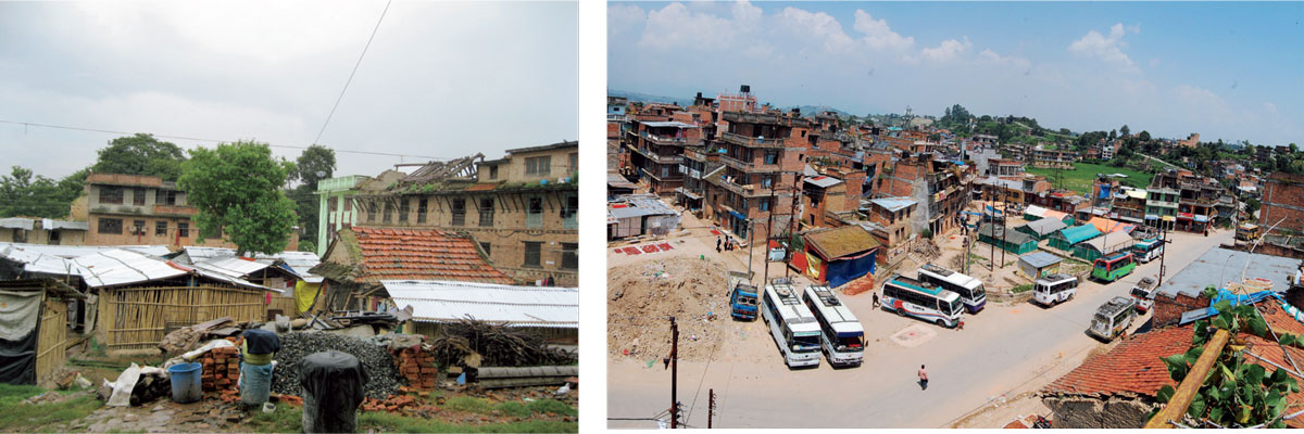
Right: Old image showing activities in a semi-private square
Facilitating disaster management through traditional Newari settlements
For Newars, the ethnic and historical inhabitants of Kathmandu Valley, it was the religious rituals and congregational nature of people, which guided the development of public spaces in traditional settlements. However, the extended family system characterised family and neighbourhood scale courtyards. These squares follow a hierarchy based on their sociocultural significance and functions. The hierarchy of squares is expressed visually by the size of space and by the scale and importance of the temple located in the square (Tewari, 2013). Square typologies have different physical aspects, defined by location and their accessibility, shape and size, varying degrees of enclosure and presence of other urban elements within the square.
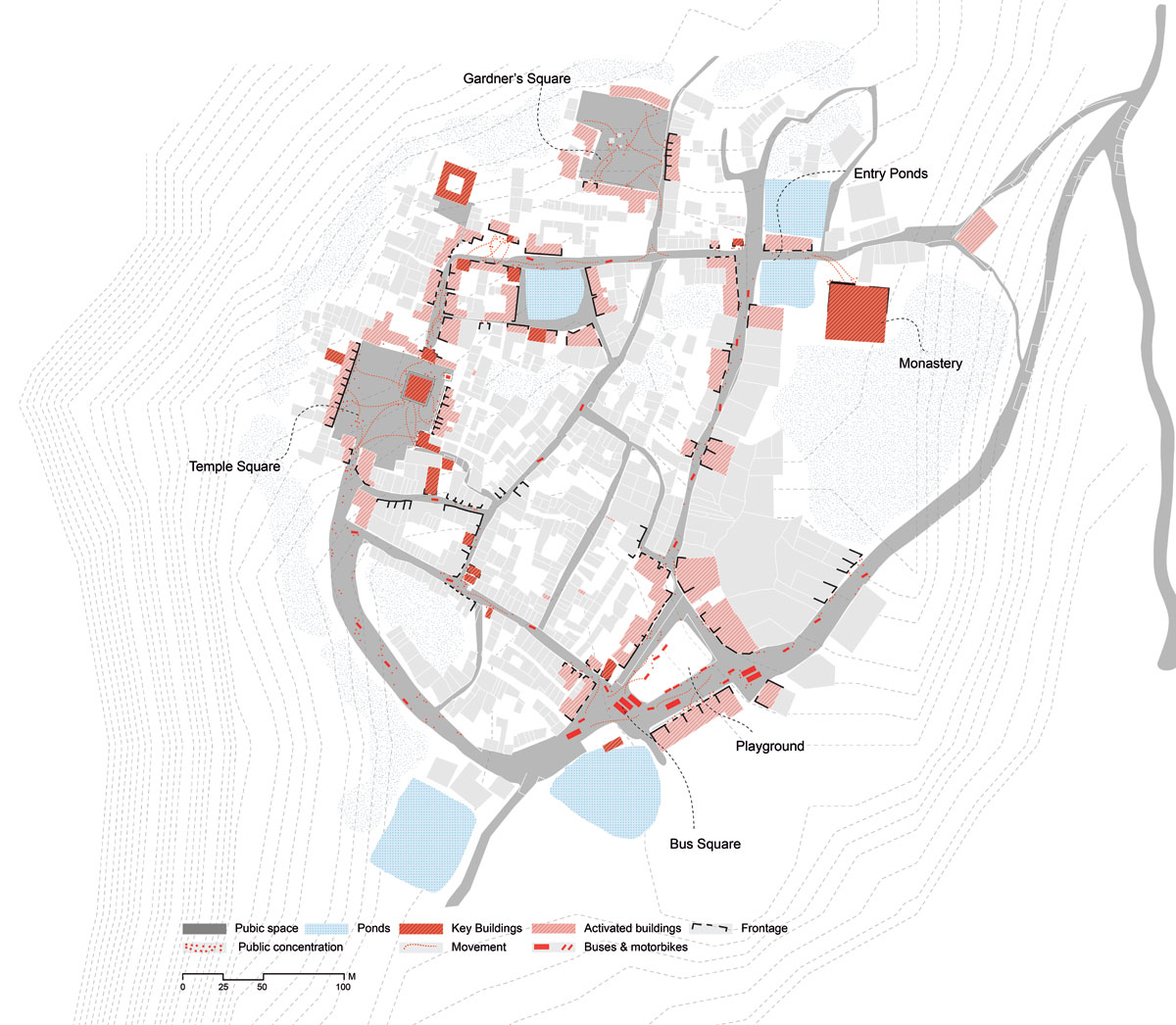
Bungamati is a small traditional settlement with agriculture and wood carving as the main occupations. The town has a close-knit community that shares strong inter-relationships and mutual dependencies (Jigyasu, 2001). The temple square, or palace square, is the biggest square and acts as the main anchoring node of the settlement, holding most of the important religious festivals as well as everyday rituals.
Neighbourhood squares provide a platform for communities to host community functions along with other everyday activities. Private squares usually belong to one family with many generations living together and is used for personal activities.
Maintenance and management of sociocultural activities and public spaces like temple squares is through community institutions called ‘Guthi’, which also helps in community integration and participation through its social network.
Traditional settlements of Newar have a compact built form, surrounded by agricultural lands and open spaces. Agriculture as the main occupation provided the town self-sufficiency in food and also an open space for protection at the time of disasters. Indigenous town planning and construction practices played an important role in the survival of traditional buildings during previous disaster events. Traditional Newar houses are made around courtyards of different scales. The size and location of these courtyards make them appropriate to be used as evacuation spaces. Since these open spaces have been part of everyday religious and social rituals, people are well aware of evacuation routes to follow at the time of natural disasters. Public facilities like pati (rest houses) and historical water spouts within public squares provide beneficial infrastructure during the time of disasters.

Multi-functional public spaces and disaster recovery: Bungamati
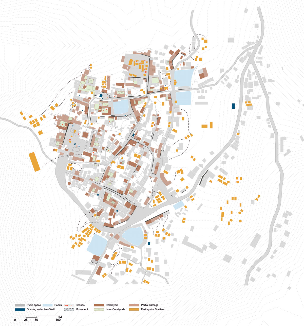
On 25 April, 2015, Nepal was hit by a 7.8 magnitude earthquake, which diminished a large part of the town to rubble, rendering many people homeless. Most of the traditional buildings were destroyed during the earthquake, as they were old and not well maintained. The rest were marked too dangerous to inhabit. All the open public spaces of the town were used as evacuation spaces, providing shelter to hundreds of people. These places also played a significant role in bringing together the community in the process of recovery.
As people were too afraid to go back to their houses, because of the possibility of aftershocks, they spent their nights in these public spaces. This was also where meetings were organised to guide residents about safety and to plan the process of rebuilding. With a series of events that took place in the months after the earthquake, let’s attempt to highlight the multiple roles public spaces played in the recovery of the town.

Right: Central square of Bungamati after the earthquake
Public spaces providing refuge: Additional layer of temporary shelters
All public squares within the town and open areas along the edge were occupied by temporary shelters. As recovery programmes were initiated, people started building temporary shelters with help from various organisations as well as independently. In most cases, people preferred to build the shelter in an open space adjacent to their homes. As most houses are built around the open squares, these squares became immediate places of shelter. The number of temporary shelters kept changing, sometimes increasing with the availability of grants and then decreasing as people started to build their own houses. However, for the people whose houses had been completely destroyed and who did not have savings to start rebuilding, these temporary shelters would become their homes for years to come. Thus, the process of recovery can be visualised by documenting these changes in shelters. The public squares also started transforming to adapt to the needs of the people taking shelter. New structures for food and water storage and construction elements were added as elements of public squares. Along with these additional functions, these urban squares keep playing their previous role: Prior to the earthquake, people gathered, dried their grains and spices and worshipped chaityas (religious structures) placed in the courtyards.
Community development: Public participation and mobilisation towards recovery
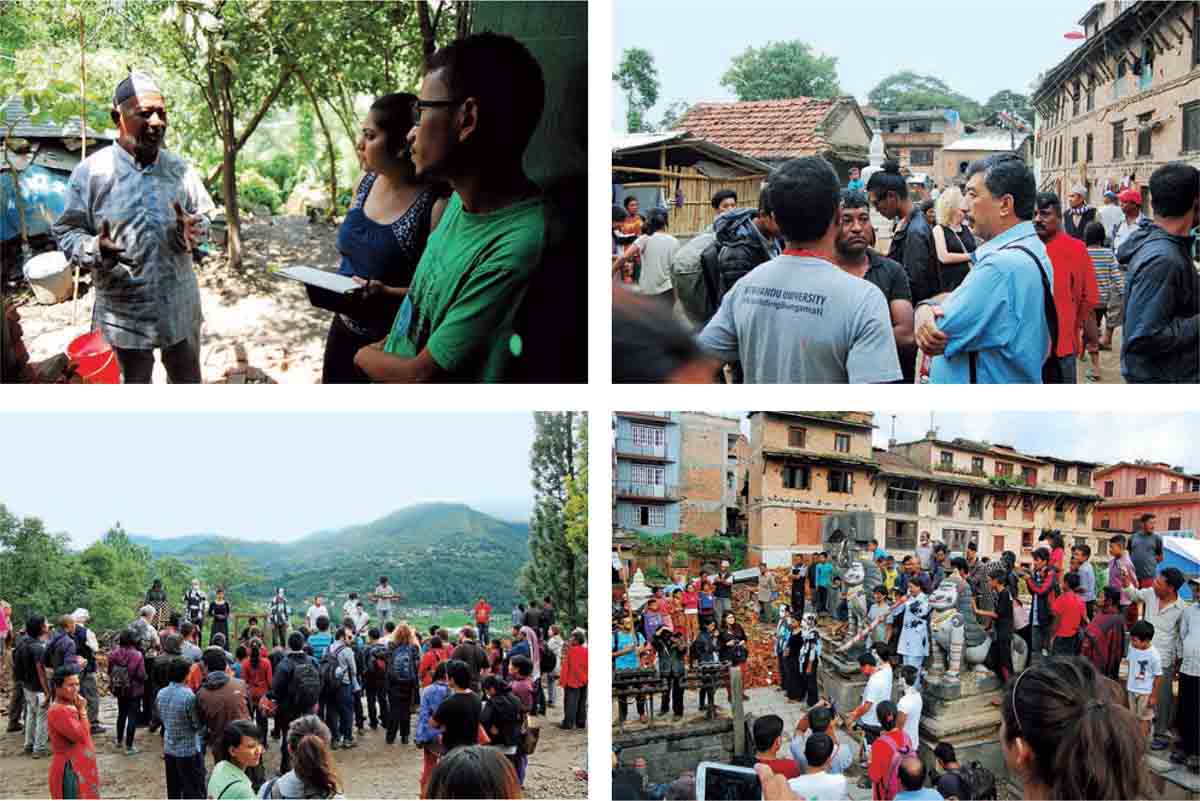
Every workshop for community building is organised in the neighbourhood squares of Bungamati. Traditionally, the town’s well-integrated community has taken collective initiatives and decisions for common interests. The collective community actions were evident in post-earthquake recovery as well. Thus, these workshops are organised to motivate the residents to participate in various rebuilding activities and mobilise the community towards recovery. In the workshops, different stakeholders, donor organisations, students and local participants come together to work collectively.
The workshop is a platform to discuss problems faced by the residents to find a solution collectively. Public squares here provide a platform for decision making, articulation and communication of public concerns and resolution of common problems of the community.
In this regard, through these workshops, public squares have continuously contributed towards the process of recovery by playing an important role in community mobilisation.
Processions and exhibitions: Community actions and collective efforts
In another attempt towards recovery, to restore the cultural and architectural heritage of the town and motivate the community towards rebuilding, the young population of Kathmandu Valley and students from various institutions came together through exhibitions and processions. Projects were taken up like ‘Rebuilding Bungamati’ from Kathmandu University and ‘Vernacular sense and essence of Bungamati’ aimed at research, documentation, construction and outreach to help in recovery along with community motivation. There was a live performance, where students focussed on vernacular architecture of the town and the need to restore it post the earthquake.

Right: Playground next to bus stop transformed with additional layer of shelters and debris collection


Top Right: Rebuilding workshop taking place in Gardener’s Square with local community, students and NGO members
Bottom Left & Right: Images of the event ‘Vernacular sense and essence of Bungamati’, by Kathmandu University students
The event was organised through festival routes in different public squares of the town. Through the event, students motivated the local residents to rebuild and restore the cultural and architectural glory of Bungamati. In this scenario, public space was used as a medium to bring together the community for collective efforts to recover from the disaster.
The series of events that took place in these public spaces highlight their role in the process of recovery. These places provided much needed space for evacuation and refuge, during as well as after the earthquake. Shared values and collective use of the space encouraged communication and response towards common problems. The use of public space for different purposes highlights their flexibility to accommodate multiple functions and play multiple roles to provide for the well-being of the community. With the nature of activities taking place in these public spaces, one could gauge the response of the community towards recovery. Initially, the spaces were filled with debris, which was slowly cleaned by the residents and the space was taken over by temporary shelters.
However, later, residents showed their spirit for rebuilding through community workshops and processions. Also, during a festival, the women worshipped the religious figures, displaying their cultural values and feelings of attachment to the place.
Based on the events discussed, the physical dimension of public space provided opportunities to arrange events like exhibitions, processions and community workshops. The social dimension of public space accommodated different actors like students, social workers, researchers, volunteers and local community.
The psychological dimension of the public space is visible in how these spaces have been appropriated by the community for diverse uses post-earthquake, while continuing to use them for social networking, festive rituals and everyday activities.
Hence, we can conclude that public spaces play a prominent role in disaster management. They are important for the well-being of residents and define the quality of life to a large extent. The diversity of usage and their ability to adapt to different circumstances allows the community to collectively work towards recovery. As the town slowly moves towards recovery, the process highlights community participation and collective efforts as key to post-disaster management, for which public space becomes a medium. Thus, along with built heritage, there is a need to preserve these public spaces, to retain cultural identity of the town, to achieve a better quality of life, as well as to maintain urban safety and resilience.


Comments (0)